MERCH, BRANDING
OG Olympics
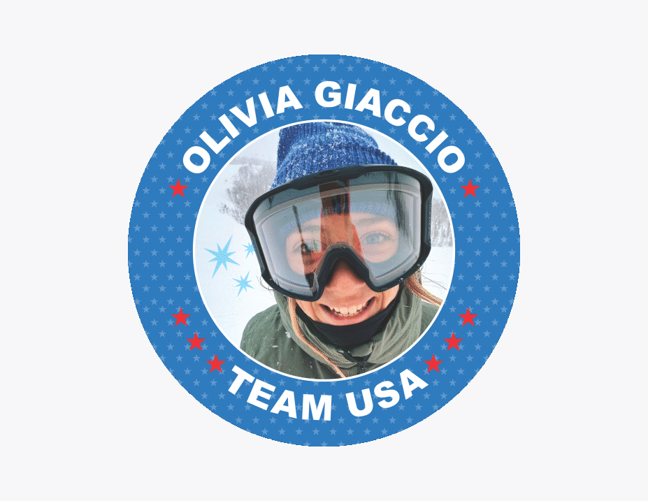
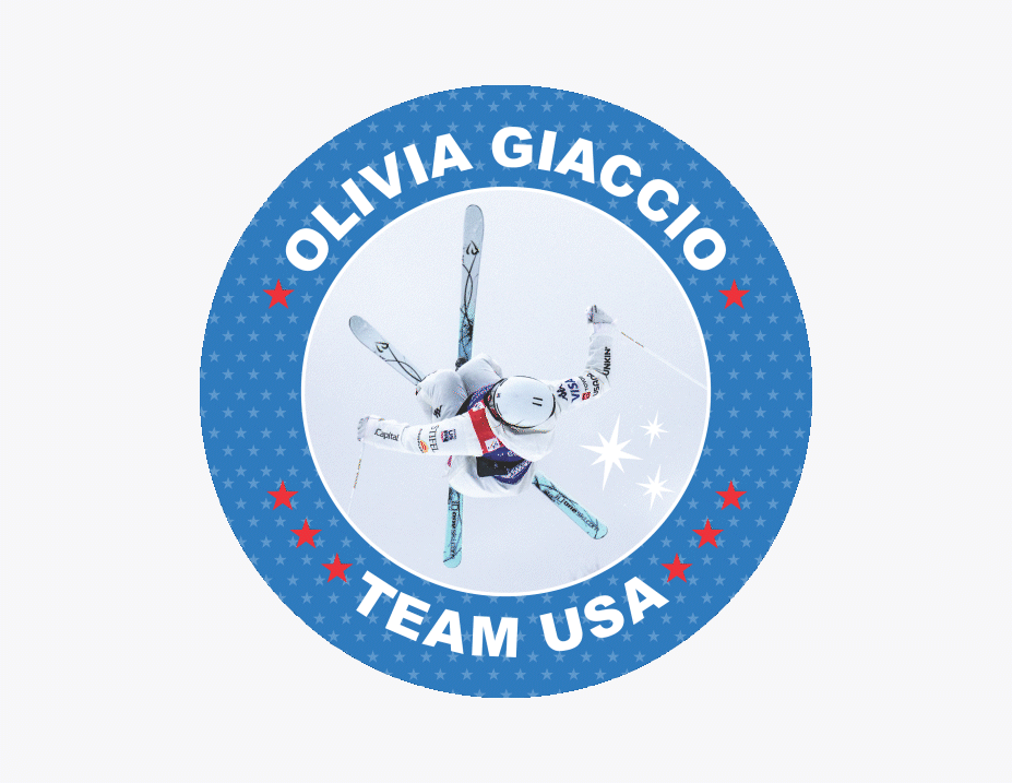
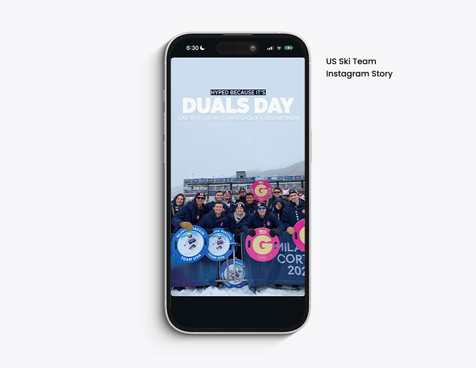
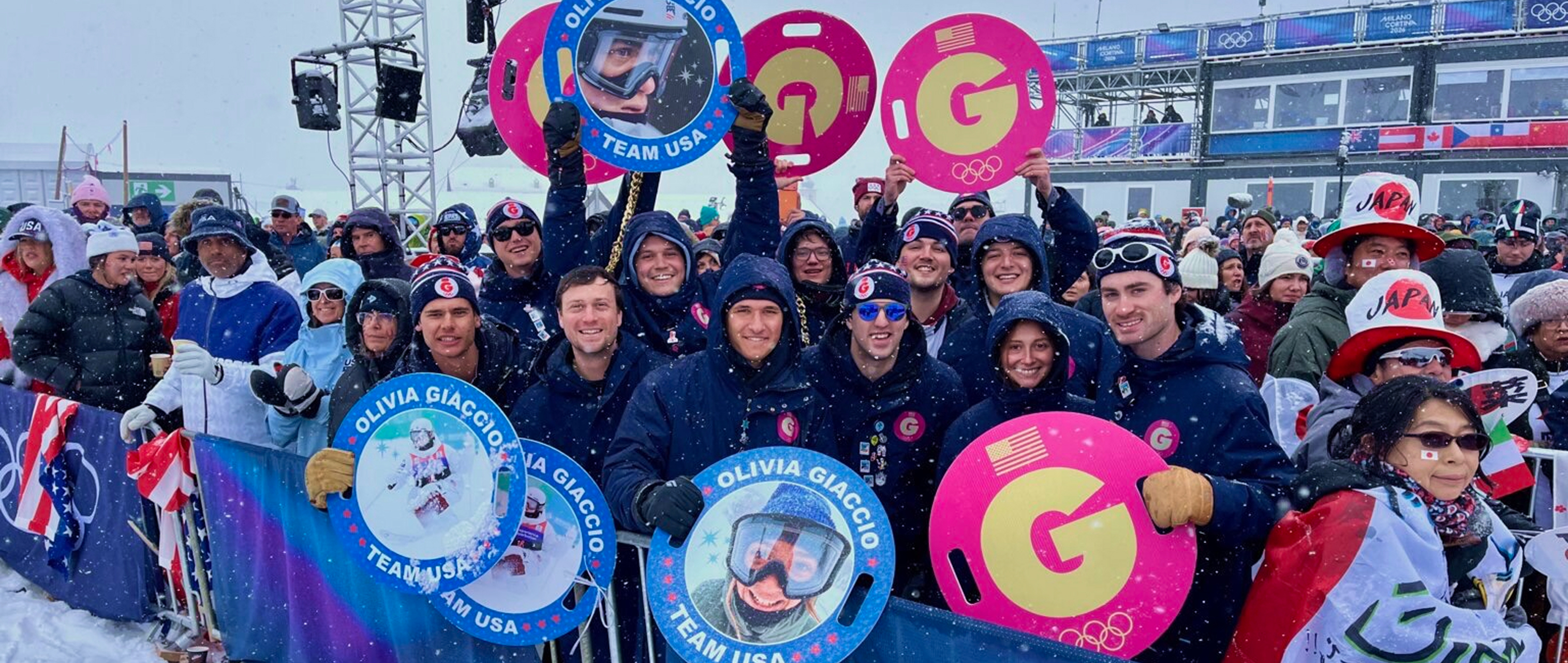
- • When my daughter, Olivia, qualified for her second Olympic Games, our family and friends traveled to Italy to support her. I was tasked with creating a bold “Team OG” identity that would stand out among other athlete supporters and give our group a strong sense of pride and unity.
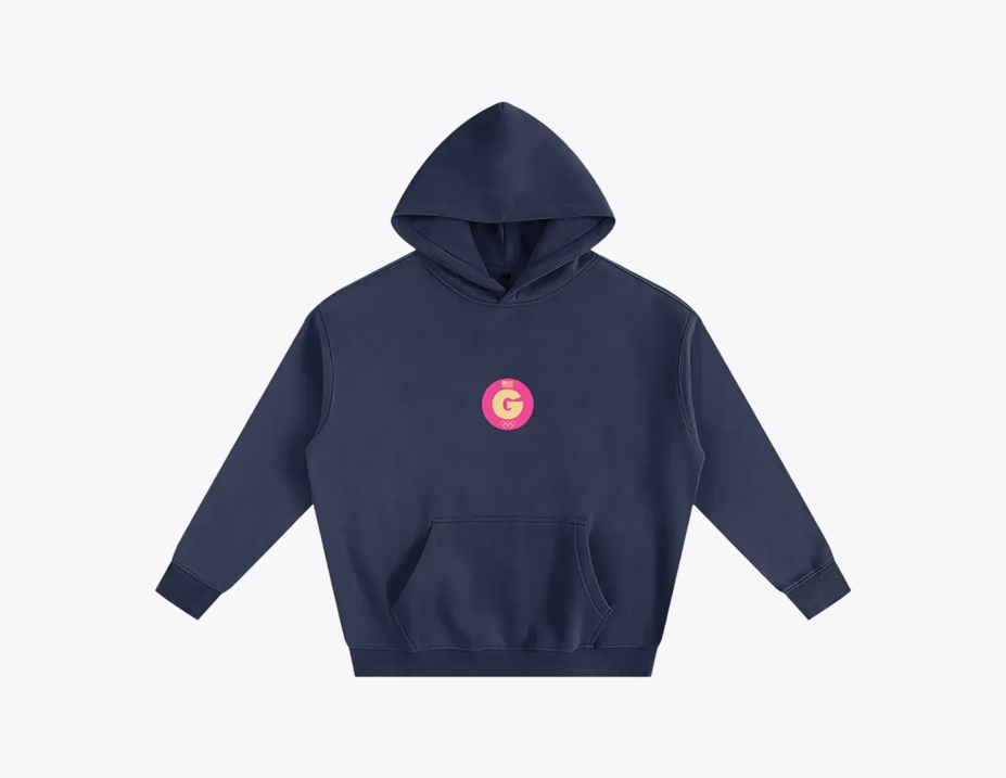
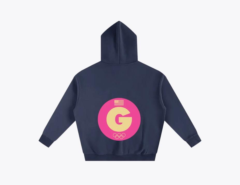
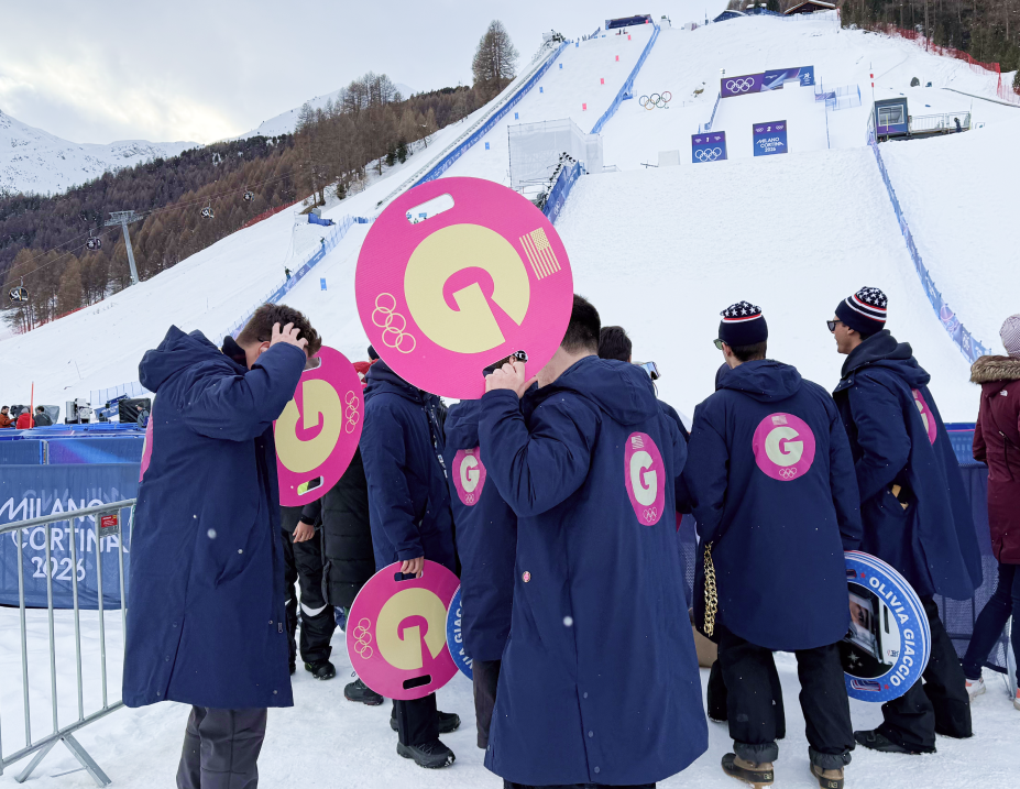
- • In developing this brand identity, I was mindful that numerous athlete supporter groups would each have their own distinct look. To ensure Olivia’s team stood out in a crowded, high-energy environment, I intentionally pursued a simple yet striking visual approach—creating a bold, cohesive identity that was instantly recognizable and impactful among the sea of supporters.
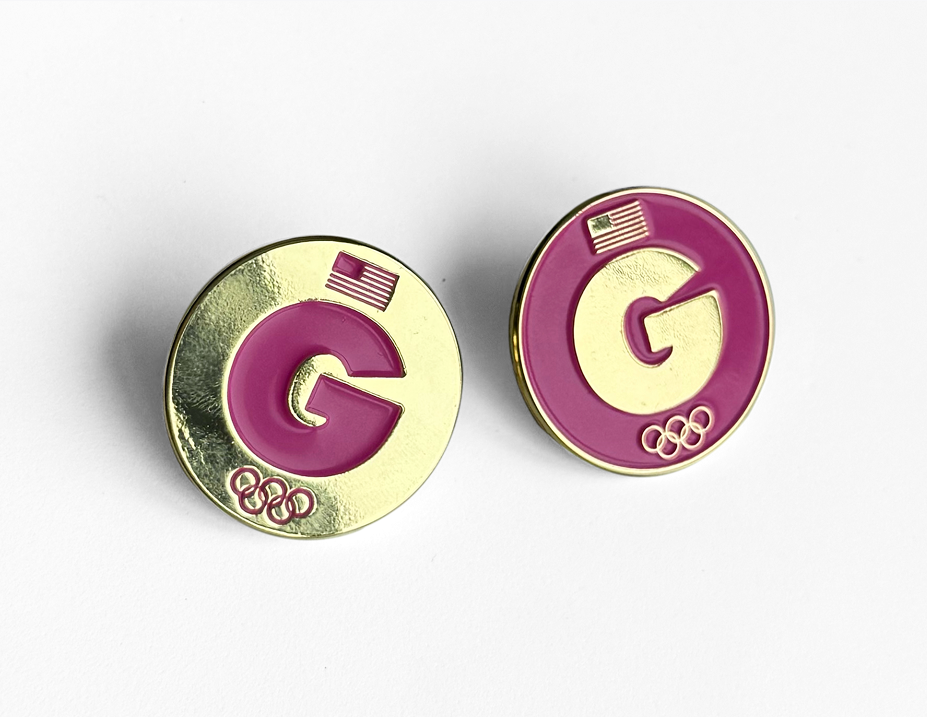
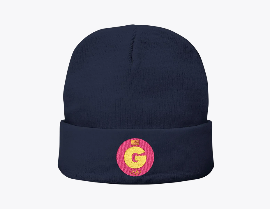
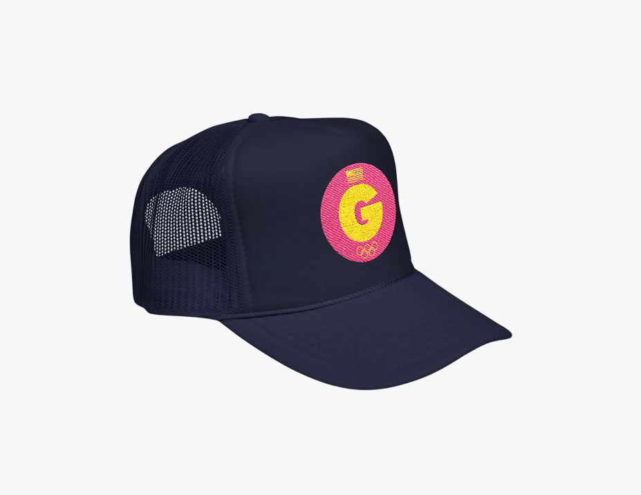
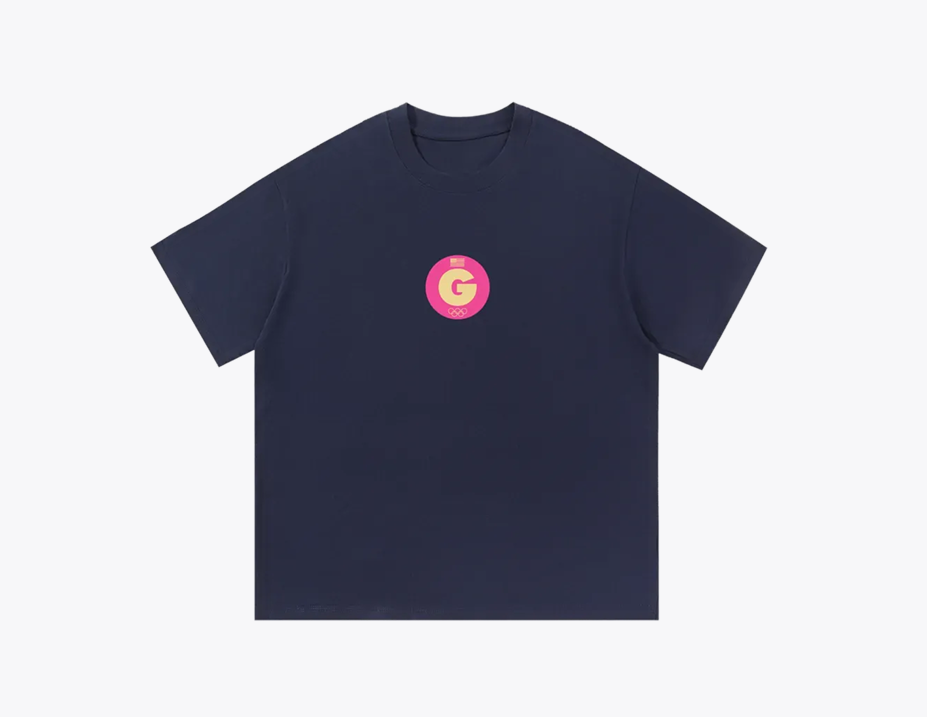
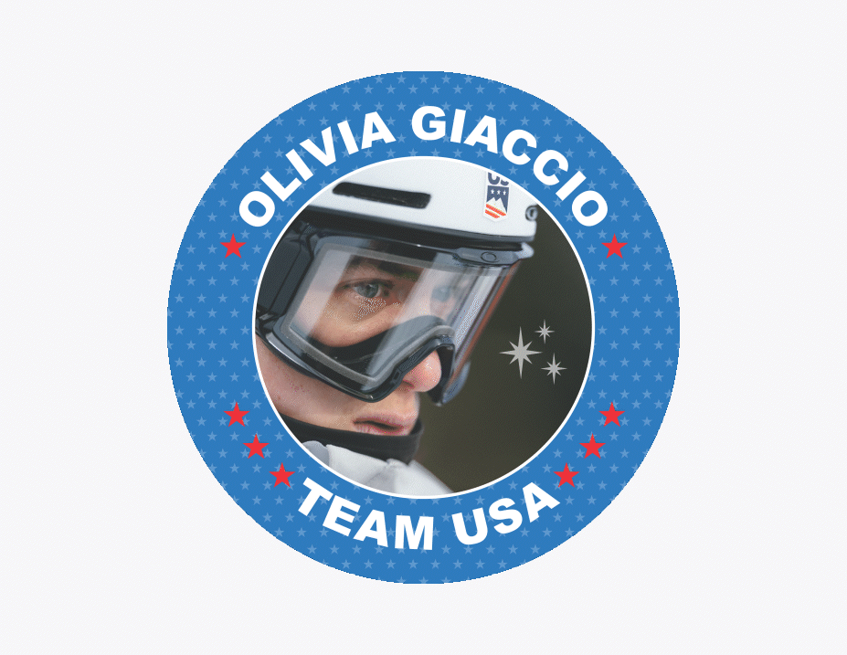
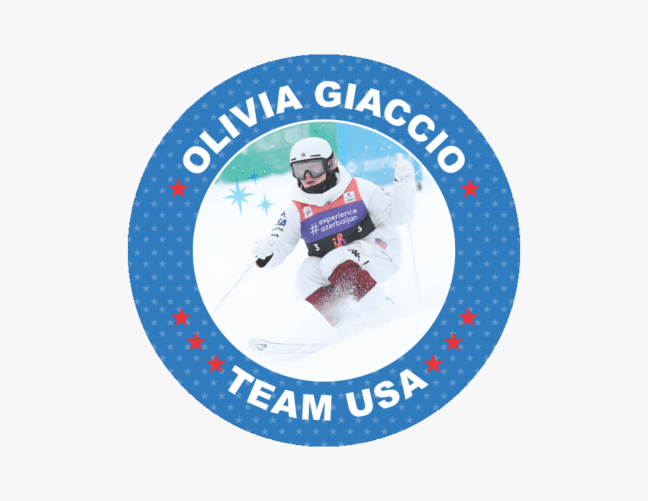
- • I set out to evolve Olivia's existing branding into an Olympic-inspired logo and visual system that felt cohesive and elevated. By merging Olivia’s current brand mark with vibrant color, subtle nods to the Olympic rings, and modern American flag elements, I created a scalable identity that translated seamlessly across signage, apparel, and accessories—delivering a unified and spirited presence on every touchpoint.
- • Despite a tight two-week window between qualification and the start of the Games, I executed full production across all assets and ensured on-time delivery for our travel date.
- • The finished identity and merchandise generated an overwhelmingly positive response, earned frequent television exposure, and sparked significant demand for additional merch—further amplifying visibility and team pride.
Task:
Execution:
Result: